Allegheny College
Art Director
Art Director
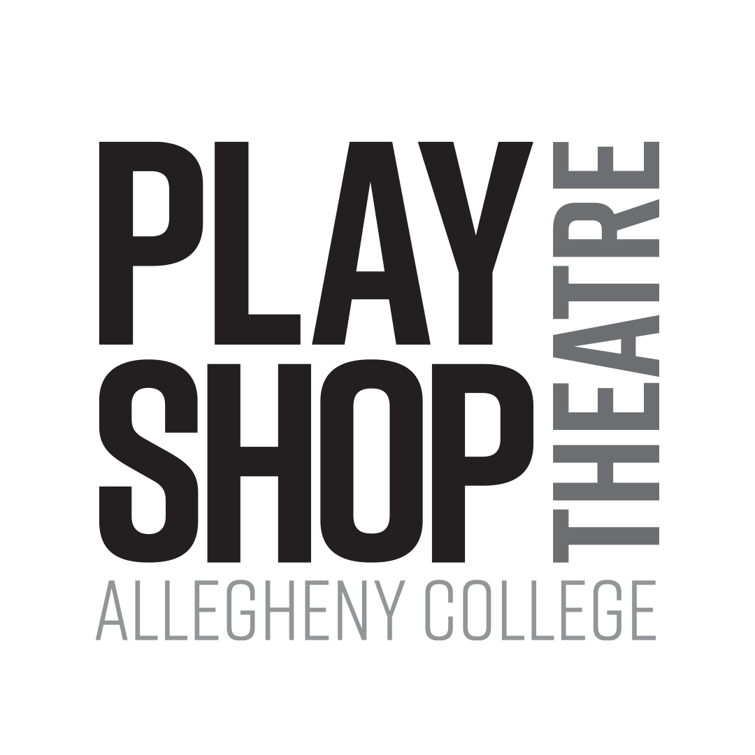
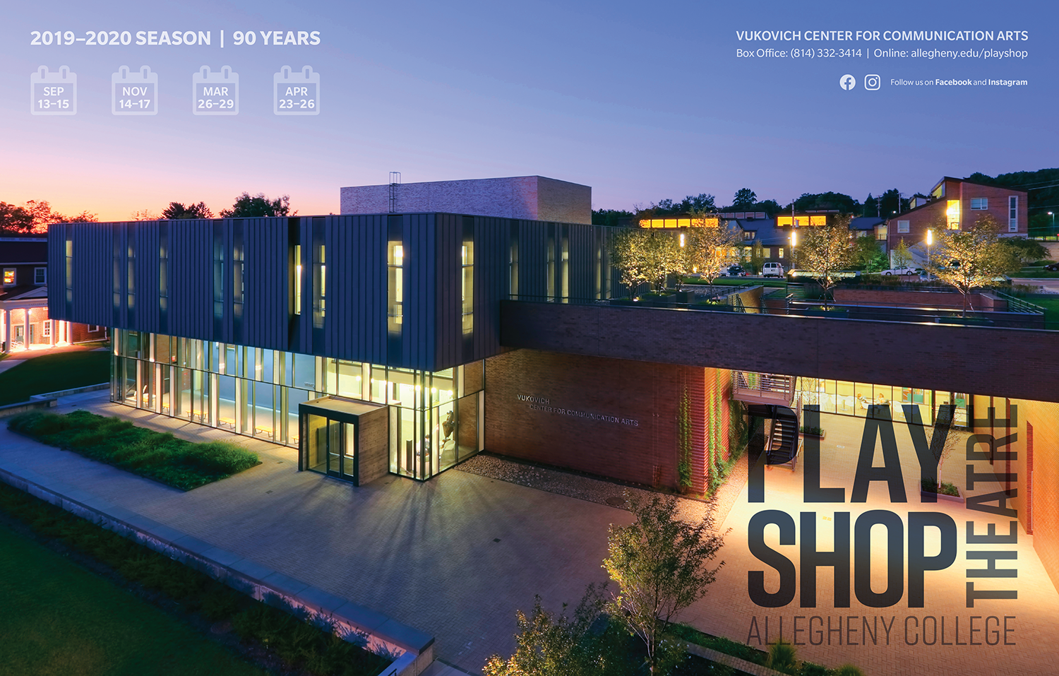
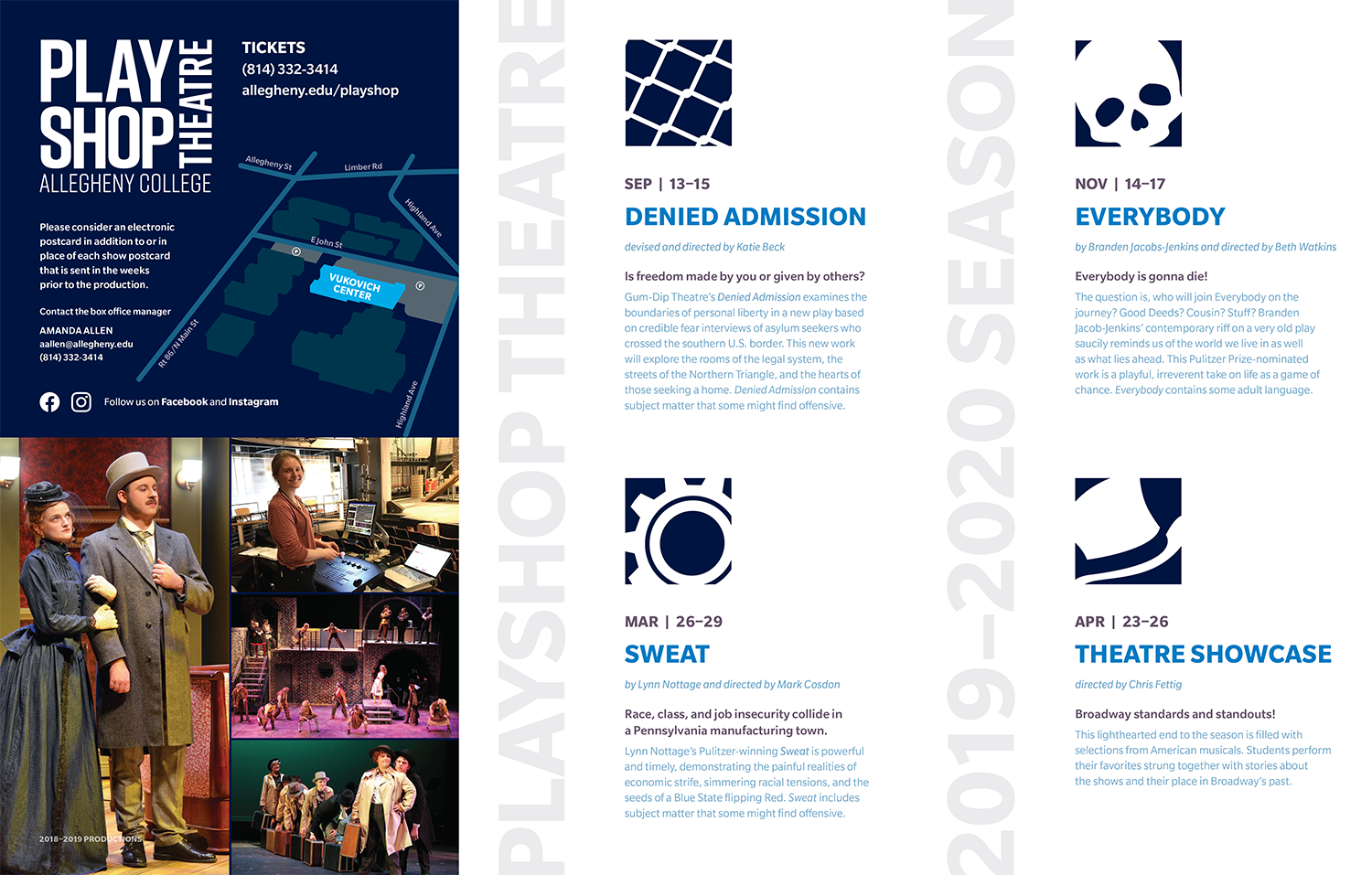
A rebrand for the Playshop Theatre on campus which has performances open to both the college and local community. The objective was to modernize the old logo and make it more versatile. This was accomplished with the layout of the typography in the logo as well as complete flexibility with color. The logo could appear as any color in a given piece, as long as it was one of the dominant colors used.
Its first use was in the season brochure, which was also redesigned. The objective there was the same: modernize the look and make it easier to read. White space was a friend. In the redesign I took it from a standard trifold to a multi-fold that expanded to the beautiful poster of the building that the Playshop Theatre calls home. Ever mindful to keep the dates of the plays visible as reminders.
Its first use was in the season brochure, which was also redesigned. The objective there was the same: modernize the look and make it easier to read. White space was a friend. In the redesign I took it from a standard trifold to a multi-fold that expanded to the beautiful poster of the building that the Playshop Theatre calls home. Ever mindful to keep the dates of the plays visible as reminders.
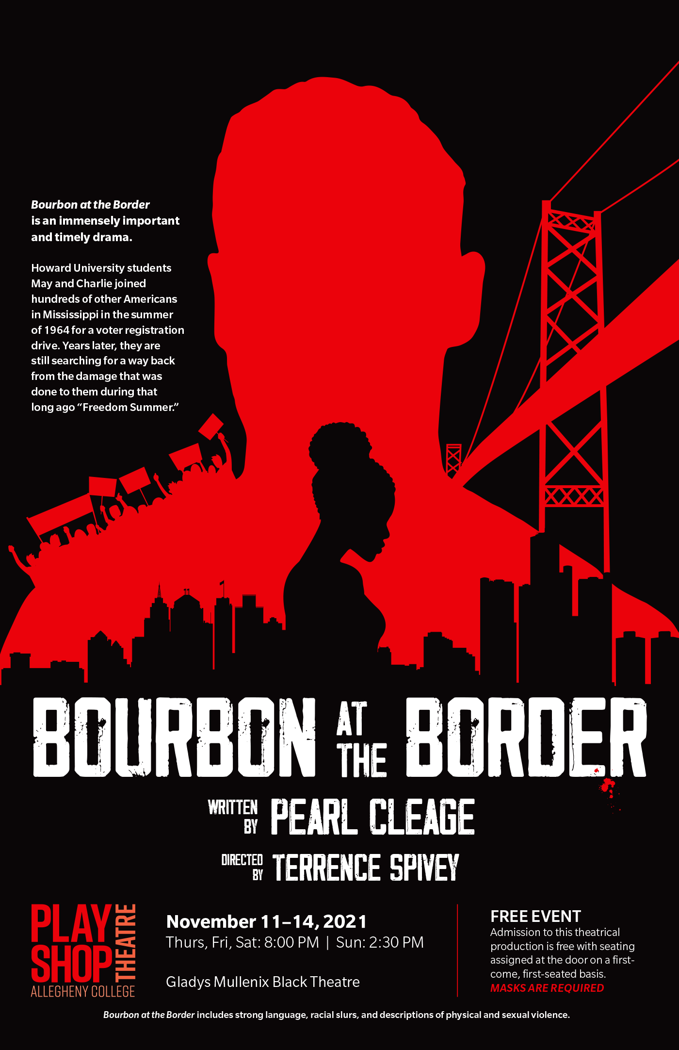
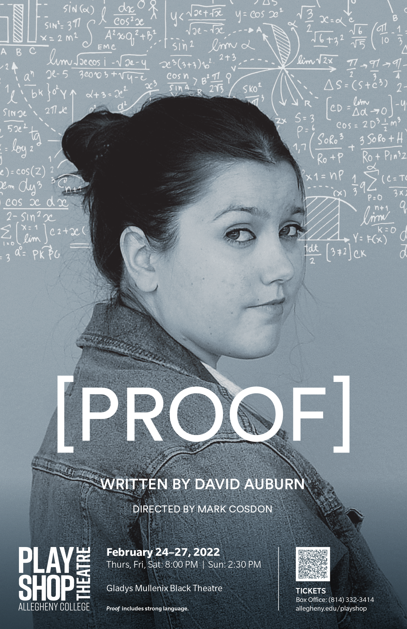
Additionally, as part of the rebrand the department posters were also redesigned. A standardized footer was developed to bring continuity to the pieces moving forward.